

Nexus Body Arts
Nexus Body Arts is a queer and trans-owned private appointment-only body piercing studio located in Seattle's SoDo neighborhood. Focusing on creating empowering experiences, safe piercing processes, and ethical practices, Nexus aims to help you celebrate and adorn yourself. I loved working with Nexus Body Arts owner, Lynn Loheide (they/them), to create a cohesive digital presence through a custom website and a series of marketing assets optimized for both print and online audiences. Yay!
Client: Nexus Body Arts
Year: 2024-2025
Services:
Website Design
Website Development
Expanded Color Palette for Digital Intentions
Print + Digital Flyer Design

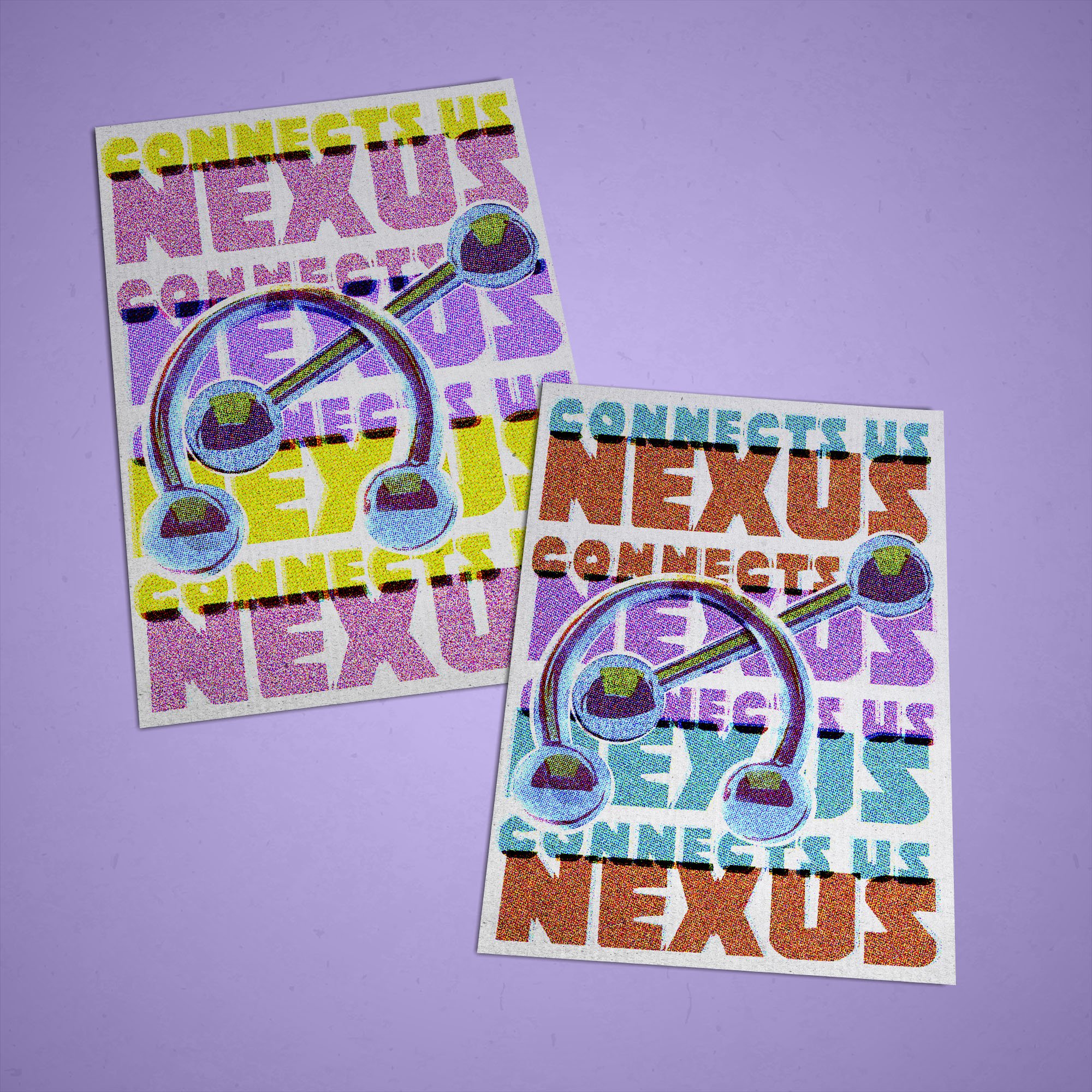
We kicked things off with a series of flyer projects, each designed to meet a different need. Some were meant to be bold and eye-catching pieces that could grab attention when posted around local haunts. Others carried a more informational focus, articulating Nexus Body Arts’ mission and their deep commitment to inclusivity and safety. With the storefront preparing to open its doors for the very first time (huge deal!!), it was essential that the marketing materials stood apart from conventional industry aesthetics. Rather than leaning into hyper-masculine tropes or ornate, mandala-inspired motifs, the direction embraced queerness, accessibility, and a sense of playfulness balanced with professionalism.
The flyers were designed to be felt as much as seen. Through considered use of texture, color, and layout, I drew inspiration from risograph printing and contemporary minimal design to create work that was tactile, approachable, and immediately legible. These pieces were built to resonate with the diverse clients Nexus Body Arts seeks to welcome, offering a fresh, artful alternative within the body art landscape.
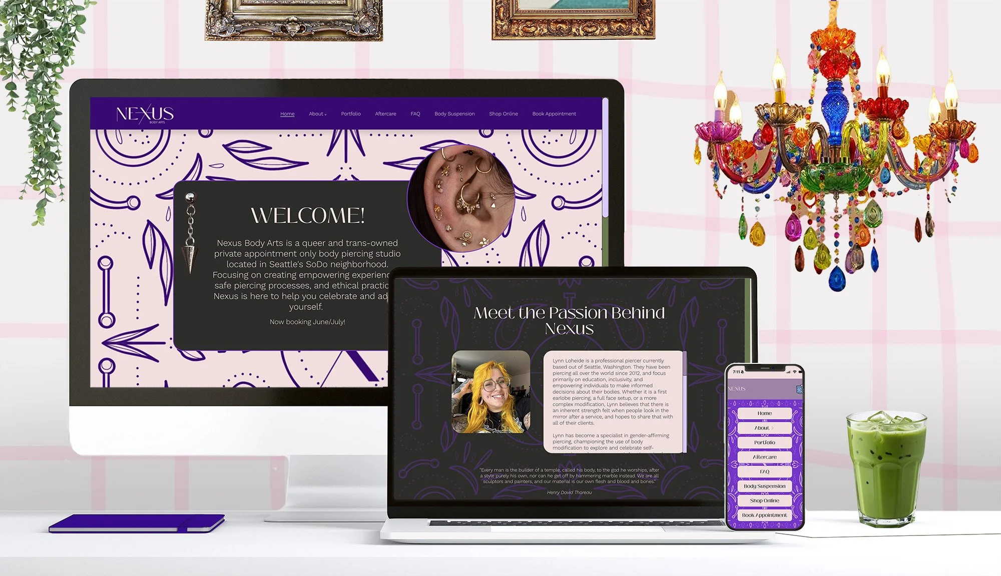
From there, we moved into the website design and build. The goal was to create a site that felt playful and engaging, while still delivering clear, functional info about the Nexus Body Arts studio. Centering their gender-affirming services was key, and the overall design leaned intentionally queer-coded, embedding subtle nods to history and culture within the details. One example is the custom mobile navigation button: a purple handkerchief peeking from a denim pocket, referencing the hanky code tradition (and, specifically, the associations between purple and piercing kinks).
Accessibility was a priority from the outset — not just for Nexus, but as a cornerstone of my own design practice. To ensure the site was both ADA-compliant and visually compelling, we expanded the existing color palette to meet accessibility standards while preserving the brand’s sense of vibrancy and warmth. The result is a digital presence that celebrates inclusivity, queerness, and play, while remaining approachable and functional for every visitor.
Nexus Body Arts expanded-for-digital color palette

“Jamie has been a dream come true to work with. As a small, queer business, we try to be very mindful about who we work with and who gets our vision. Jamie is the whole package. They have worked with us to create a playful, fun website that our clients adore. They've also designed flyers and print media and helped us find ethical companies to work with for our merchandise. Working with someone who understands our vision, aligns with our ethics, and communicates well has been awesome.
As a small business, we have to be so mindful about where our limited funds go. This was a more than worthwhile investment, that has paid off with growing clients, constant compliments on our website, and a focus on ethical marketing that leaves us feeling like our money was well spent supporting others businesses. Jamie helped us not just build a brand, but a community. We are forever grateful.”
Lynn Loheide
Founder of Nexus Body Arts