Yulita Zavada
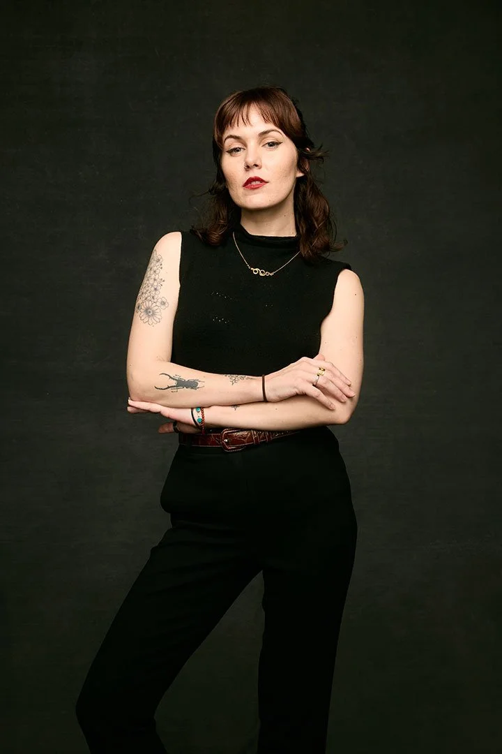
Yulita Zavada (she/her) leads multi-sensory creative direction and production for brands and cultural projects, translating narrative into experiences people remember. Her work spans creative direction, experiential production, and spatial design, focused on shaping how stories are felt through lighting, sound, food, space, and movement. I loved developing Yulita’s personal brand and digital presence through creating a brand design system, a website, and a business card design. Yay!
Client: Yulita Zavada
Year: 2025-2026
Services:
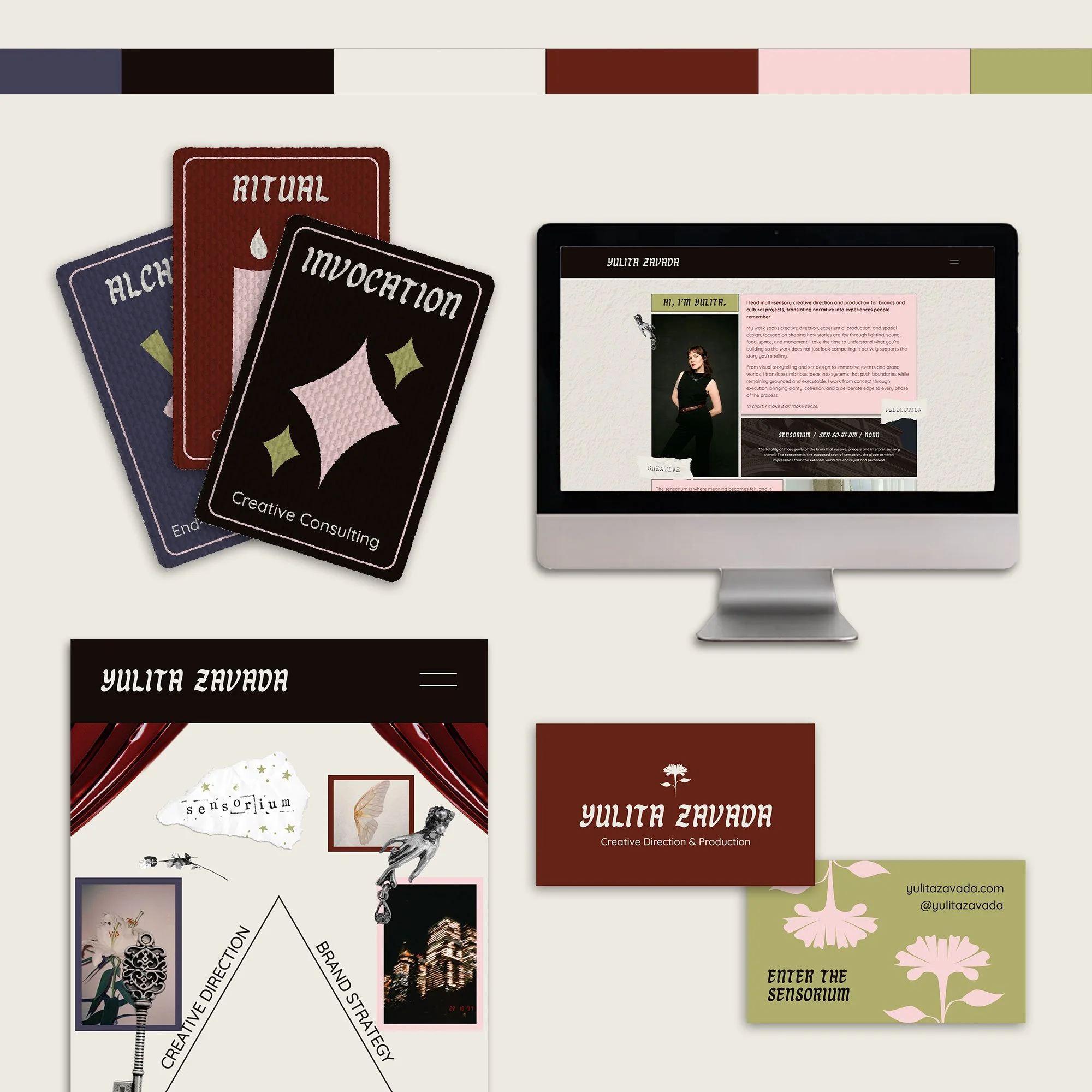
Brand Design Development (colors, fonts, and a logo emblem)
Website Development and Full Buildout
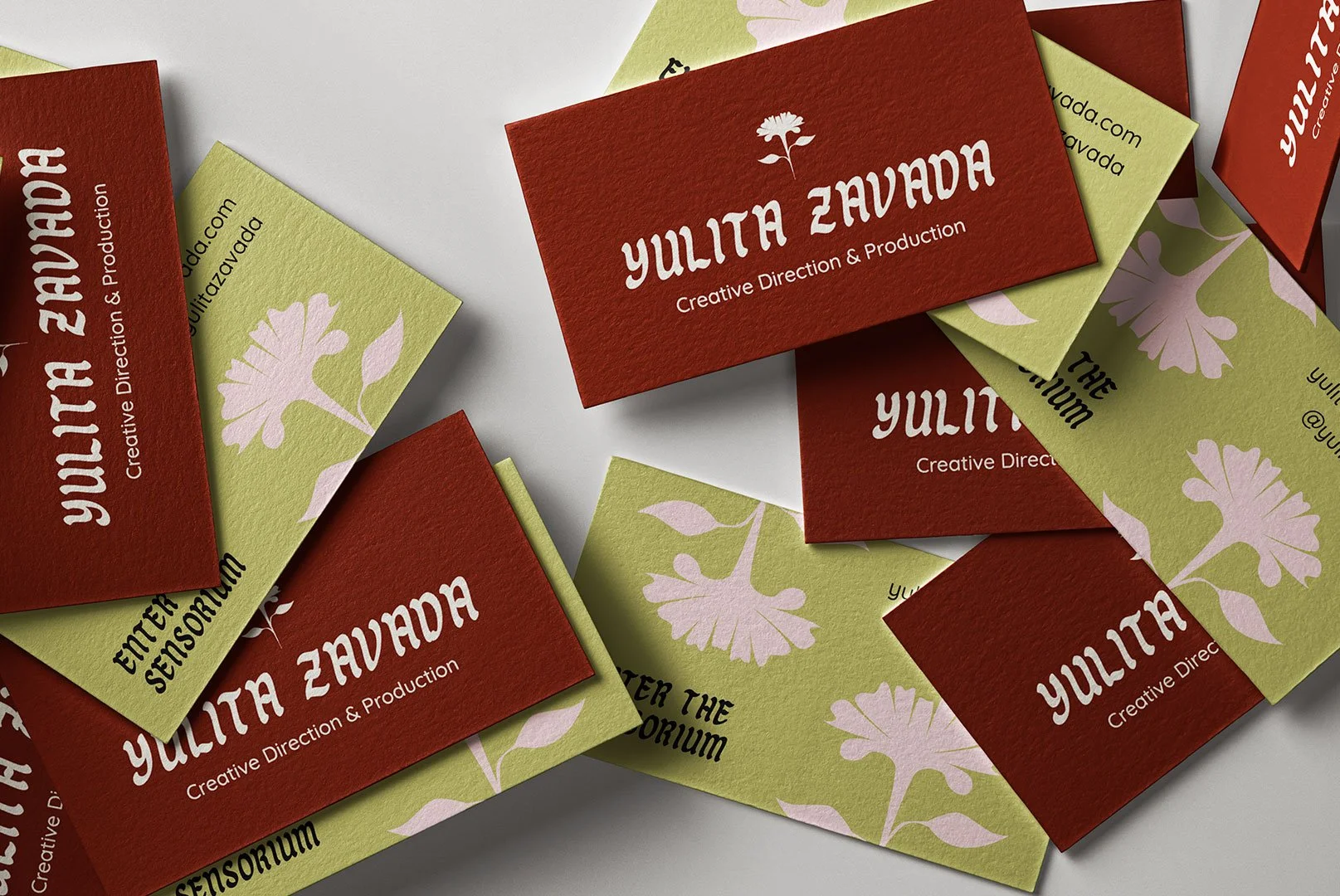
Business Card Design
We started our work together by focusing on the brand design foundations, as this was going to inform everything else we build together.
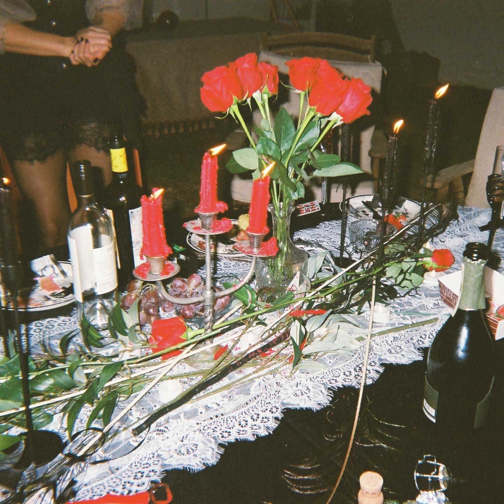
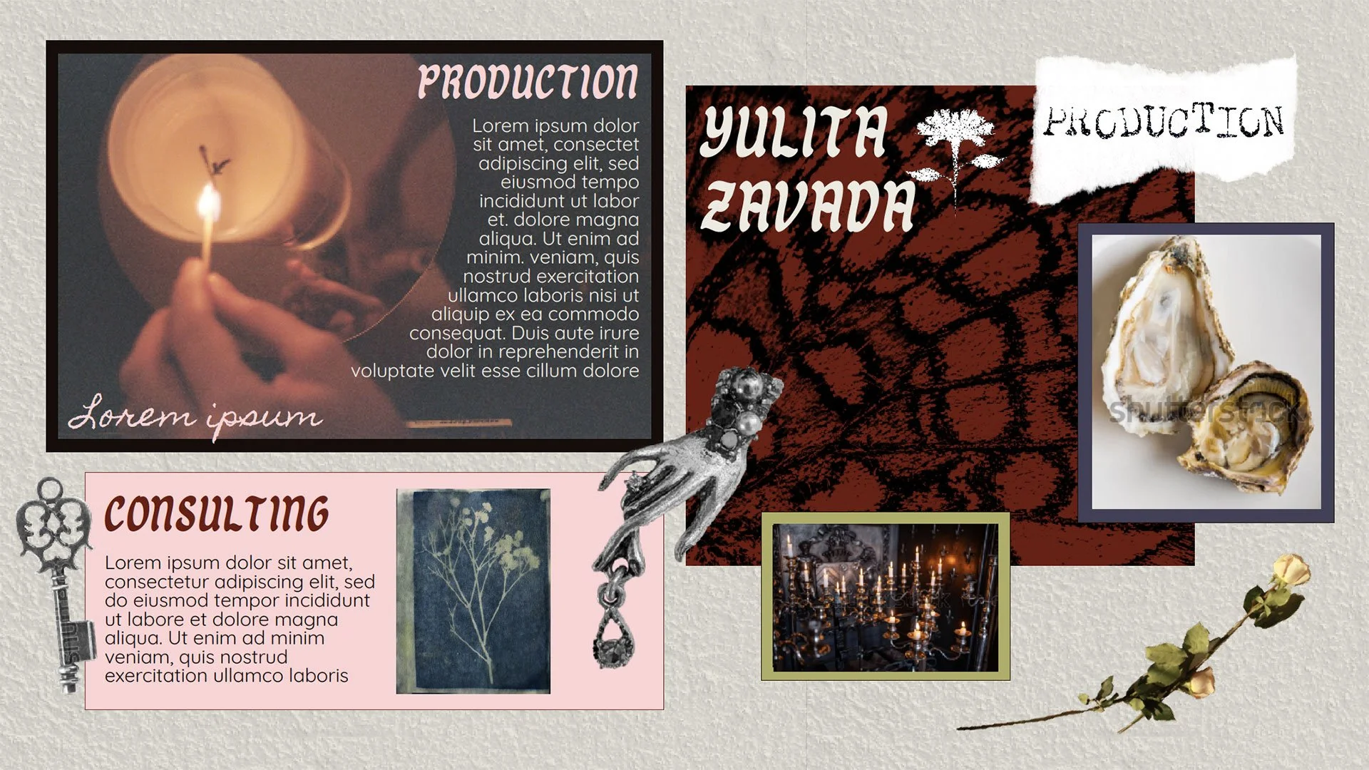
Off the bat, I felt that doing something trendy or overly startup-y was not the vibe. The goal was to exude quiet confidence with editorial structure, poetic details, and witchy, gothic accents. From there, a brand direction was developed that could live on a website, in a deck, on a business card, etc, and still feel consistent without creating an overwhelming, overly precious brand system that Yulita would feel stuck inside.
From there, we built out a font system and color palette. This meant choosing typography that could carry Yulita’s voice and resonate with her customers (elegant, experimental, legible), and a color palette that felt just as present. I thought of it more as an environment than a set of typical brand colors. Every element was selected to support clarity, contrast, and easeful real-life use.
I also ensured that the final color palette, and the way it was used throughout the site, is ADA-accessible, as I do with every website I work on.
It was important that this brand foundation was flexible enough that Yulita, who was at the beginning stages of her business, could make adjustments through time as she pivots and grows, and not feel completely locked in on the first iteration.
After combing through Yuilta’s Pinterest inspo board, I couldn’t help myself, and I developed the flower vector art that then became the official emblem for the brand.
Once we felt confident about the brand design, we moved into the website build. The biggest priority was creating something Yulita can update on her own, without breaking layouts, losing styling, or needing a designer for every little tweak. The structure is intentionally clean and modular, so she can swap images, update copy, add new offerings, and evolve as her business evolves. But also enchantingly customized, with esoteric surprises on every page.
The design itself leans into a witchy, editorial, artful approach to creative direction and experiential production. My personal favorite parts are the bespoke custom charms floating throughout the website. Some of the charms are from my own jewelry collection, others are from Yulita’s photography collection.
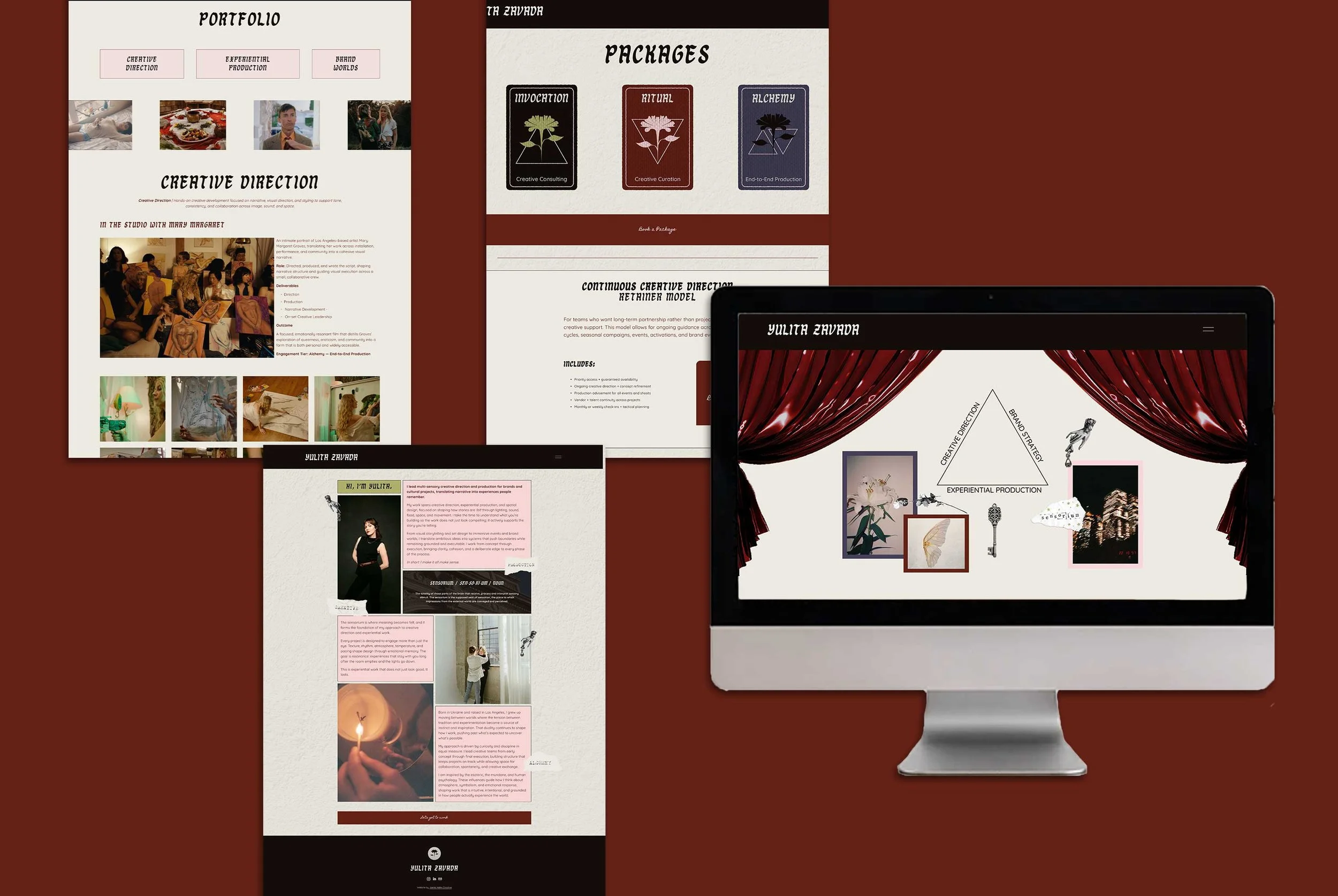
To bring everything we built together into the physical realm, it was time to design business cards she can confidently hand out at every soiree. The goal was for the business card to feel like a tiny physical extension of Yulita’s vibe and quality of services. We kept them minimal, confident, and memorable. Final files were delivered as print-ready with clear specs, and with guidance on how to communicate with the printer of her choice.